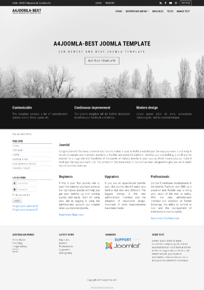
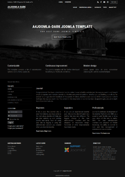
 This is our best modern customizable joomla 4 template with the following features
- joomla 5 template
- you can see the demo site here
- fullscreen header
- based on the Bootstrap framework
- responsive template (also fits to mobile devices)
- 12-column grid system
- 2 dropdown menus
- portal or blog layout
- 13 social icons
- 21 module positions
- a lot of customizable features
Upgrade from joomla 4 to 5
First read the official instructions of this upgrade by clicking here. Then these are my template related instructions:
- Does your server satisfy the joomla 5 technical requirements?
- Are your joomla extensions compatible with joomla 5? If yes, then:
- backup
- save your old template and its user.css file
- set error reporting to maximum
- update extensions
- update to joomla 4.x
- save screenshots of your template parameters
- set cassiopeia default
- Joomla Update/Options/Update channel: set Joomla next
- Pre-update check
- update to joomla 5.x
- uninstall old template
- install new template and set it default
- set up template parameters
- clear cache everywhere
- test
- set error reporting to default
- backup
CSS classes to hide some of your modules on mobile in the "Module class suffix": You can find the new css classes for hiding modules here. You can hide modules on different display sizes: xs=extra small, sm=small, md=middle, lg=large, xl=extra large, xxl=the largest.
Template parameters
After template installation and choosing it to the default template, click on the template's name in the template manager to set the parameters.
The template uses a 12-column grid, so the Layout/Right column width, and the Layout/Left column width are the number of columns in the 12 column grid. You may have to play with these settings. Always check how the site looks when you decrease the browser window size, because the template is responsive, and the look of the site changes with the browser (or display) size.
The social and search icons will be displayed only if you type some URL for their parameters. You have to set up a search page, and put its URL to the search page parameter to have a search icon. To make a search page, create a new hidden menu, that has no published module, then create a new search menu item, save it, and copy its alias to the end of the site URL to see the search page.
The main sections of the template parameters:
- background and logo
- fullscreen header
- layout
- typography
- social icons
- module positions
- topbar
- footer
Logo
If you use an image logo, I suggest to resize it in a graphic editor e.g. to have a height of 70px.
Top menu (dropdown menu) settings:
In position-1 you can setup a dropdown menu, just remove everything from the "Menu class" and "Module class" of this module in the module manager, set Layout: Default, Module Tag: div! Also set the "Show submenu items" to "Yes"!
Topbar horizontal menu (dropdown menu)
In position-13 you can also setup a horizontal menu, just remove everything from the" Menu class" and "Module class" of this module in the module manager, set Layout: Default, Module Tag: div! There are also settings of the topbar in the template parameters.
Side menu style
If you want a side menu that looks like the menu on the left, set the "Module class" to _menu and remove everything from the "Menu class", set Layout: Default, Module Tag: Div!
user1...user10 positions
You can set a title for these module position in the template parameters, a background image, the color of the background, text, heading, and links. You can place this module position above or below the joomla content area. The module widths can be set by setting the Bootstrap size in the module settings. The sum of the Bootstrap sizes of the modules must be 12, as the template has a 12 column grid.
Module positions:
Module positions that are not shown in the picture below are: position-6 (right sidebar), user4...user10, inner1 (just above the joomla articles), inner2 (just below the joomla articles), slideshow (for a 3rd party slideshow module).

Mobile
This template is responsive, so it adapts to the size of the mobile device. You can also see this on a desktop computer when you decrease the size of your browser. But it's worth hiding some of the modules on mobiles, because the order of the content of the website corresponds to the order of that in the source code. For this purpose you can use some css classes for the modules in the "Module class suffix". You can find the css classes for hiding modules here. You can hide modules on different display sizes: xs=extra small, sm=small, md=middle, lg=large, xl=extra large, xxl=the largest.
Child template for template modifications
You can put your own CSS code into a css/user.css file that you have to create if you need it. It is better to upload it into a child template, that you can create at System/Site templates/a4joomla-best/Create Child Template. You can upload end edit files here in joomla. The files of the child template has priority over the files of the parent template, and they are not changed in case of a template update.
Favicon
You need to upload 3 favicon files into the images folder of the template: favicon.ico, joomla-favicon.svg, and joomla-favicon-pinned.svg. First create the favicon.ico file and a safari-pinned-tab.svg file from your png or jpg here: https://realfavicongenerator.net/ . Then convert your png or jpg file to svg here: https://convertio.co/png-svg/ . Then create a favicon.svg file from your svg here: https://realfavicongenerator.net/svg-favicon/ . Now rename the safari-pinned-tab.svg to joomla-favicon-pinned.svg, and the favicon.svg to joomla-favicon.svg, and upload them together with the favicon.ico file into the images folder of the template!

