The main features and settings of this joomla template are:
- joomla 3.x template
- you can see the demo site here
- based on the Bootstrap framework
- cross-browser compatible
- responsive template (also fits to mobile devices)
- 12-column grid system
- dropdown menu
- portal or blog layout
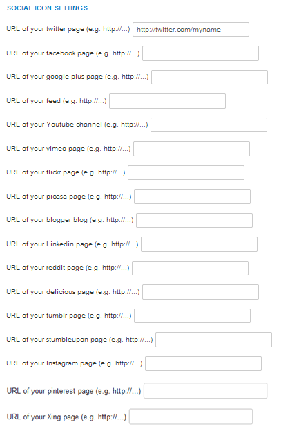
- 15 social icons
- 5 color schemes
- 2 module styles
- 13 module positions
- module position for a 3rd party slideshow module
- several customizable features, see the template parameters below
Template parameters
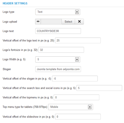
After template installation and choosing it to the default template, click on the template's name in the template manager to set the parameters shown below.
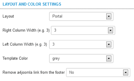
The template uses a 12-column grid, so the Logo width, the Right column width, and the Left column width are the number of columns in the 12 column grid. You may have to play with these settings. Always check how the site looks when you decrease the browser window size, because the template is responsive, and the look of the site changes with the browser (or display) size. For tablet devices you can choose between the mobile topmenu and the horizontal dropdown topmenu. The latter may not be handled well on some tablet devices. But the horizontal menu can also be good for tablets if there are no submenu items.
We removed the old built-in slideshow, and use a 3rd party free responsive slideshow module: Ari Image Slider for demonstration purpose on the demo site. It's not part of the template, you have to download it, and set it up in its module settings, not in the template parameters.
The social icons will be displayed only if you type some URL for their parameters.
Module positions
The following module positions exist in this template:
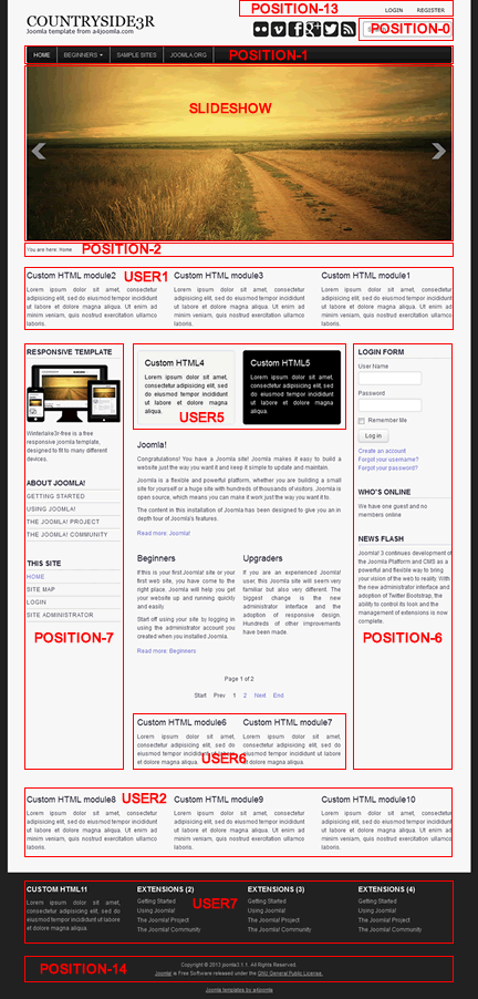
The slideshow module position can contain more modules side by side.
Top menu (dropdown menu) settings:
In position-1 you can setup a dropdown menu, just set the "Menu class suffix" to (space)nav-dropdown and remove everything from the "Module class suffix" of this module in the module manager! Also set the "Show submenu items" to "Yes"! Mouse over the Parameters menu item above to see that the horizontal line in the submenu is a "text separator" menu item, the Color schemes is a "Menu heading" menu item.
Second horizontal menu
In position-13 you can setup a horizontal menu, just remove everything from the "Menu class suffix" and the "Module class suffix" of this module in the module manager! This menu is not a dropdown menu.
Side menu style
If you want a side menu that looks like the menus on the demo, set the "Module class suffix" to _menu and remove everything from the "Menu class suffix"! If you also want to hide it from mobile phones, set it this way:
Module class suffix:_menu hidden-phone
Menus in the user7 position
You can style the menu without bullets and separators in user7, if you set the "Module class suffix" to _menu2 and remove everything from the "Menu class suffix" in the module settings.
Login module
Set the "Display Labels" to "text" in the module settings, because the other setting is not cross-browser compatible.
USER1,2,5,6,7 positions
You can set the module widths in the user1,2,5,6,7 positions by setting the "Bootstrap size" parameter in the module settings. The sum of the module widths in a module position should be 12, because a 12-column grid is used in this template.
Light and dark module styles
You can set a light or dark background for the modules in the position-6,7, user1,2,5,6 module positions by setting (space)light or (space)dark "Module class suffix" in the module settings.
Slideshow
The old built-in slideshow was removed from this template, instead of it a 3rd party slideshow module can be used in the slideshow module position. For demonstration purpose the free and responsive Ari Image Slider was installed for the demo site. You can also place more modules side by side in the slideshow module position, just set the "Bootstrap size" in the module settings (Options/Advanced options/Bootstrap size) so that the sum of the Bootstrap sizes must be 12. On the demo site the slideshow module has a Bootstrap size: 12. Here I show some of the more important Ari Image Slider module settings of mine for the slideshow:
Details:
- Hide title
- Choose position: Slideshow
- Publish
Options:
- Load JQuery method: local copy
- Width: 900
- Height: 376
- Responsive: Yes
- CSS styles: .nivoSlider { -moz-box-shadow: none; -webkit-box-shadow: none; box-shadow: none; }
- Transition effect: Fade
- Nr. of slices: 2
- Show slides navigation: No
- Nr. of images: 2
- Sort by file name
- Sort direction: Ascending
- Image path (upload your images here in the media manager): images/sampledata
- Bootstrap size: 12
Menu assignment
- Module assignment: on all pages
Mobile devices
This template is responsive, so it adapts to the size of the mobile device. On the demo site you can also see this on a desktop computer when you decrease the size of your browser. But it's worth hiding some of the modules on mobiles, because the order of the content of the website corresponds to the order of that in the source code. For this purpose you can use some css classes for the modules in the "Module class suffix". E.g. type
(space)hidden-phone
into the "Module class suffix" if you want to hide a module from mobile phones. You can read more about this topic if you click here.
CSS modifications
From template version 3.5, you can put your own CSS code into the css/user.css file that you have to create if you need it.
Less files
If you want to use the less files, don't use the Less compiler joomla plugin, because I found it buggy. I rather used the Winless software, but the main point is to use something that uses the original less.js.