Template parameters
After template installation and choosing it to the default template, click on the template's name in the template manager to set the parameters.
The template uses a 12-column grid, so the Layout/Right column width, and the Layout/Left column width are the number of columns in the 12 column grid. You may have to play with these settings. Always check how the site looks when you decrease the browser window size, because the template is responsive, and the look of the site changes with the browser (or display) size.
The social and search icons will be displayed only if you type some URL for their parameters. You have to set up a search page, and put its URL to the search page parameter to have a search icon. To make a search page, create a new hidden menu, that has no published module, then create a new search menu item, save it, and copy its alias to the end of the site URL to see the search page.
The main sections of the template parameters:
- text logo settings
- fullscreen header
- layout
- typography
- social icons
Top menu settings:
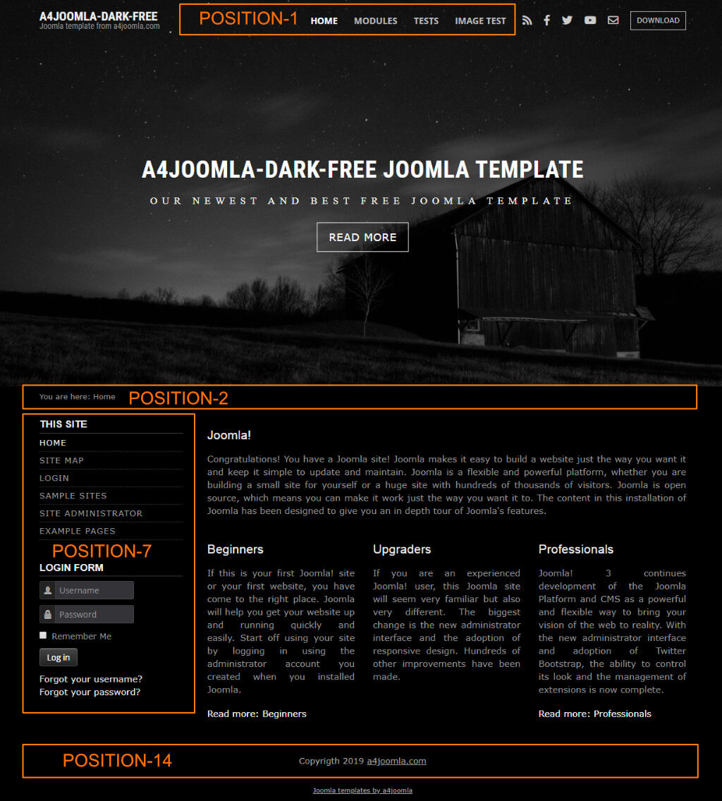
In position-1 you can setup a menu, but this free version does not support a dropdown menu. Remove everything from the "Menu class" and "Module class" of this module in the module manager, set Layout: Default, Module Tag: div!
Side menu style
If you want a side menu that looks like the menu on the left, set the "Module class" to _menu and remove everything from the "Menu class"!
Module positions:
The module position that is not shown in the picture below is: position-6 (right sidebar).

Mobile
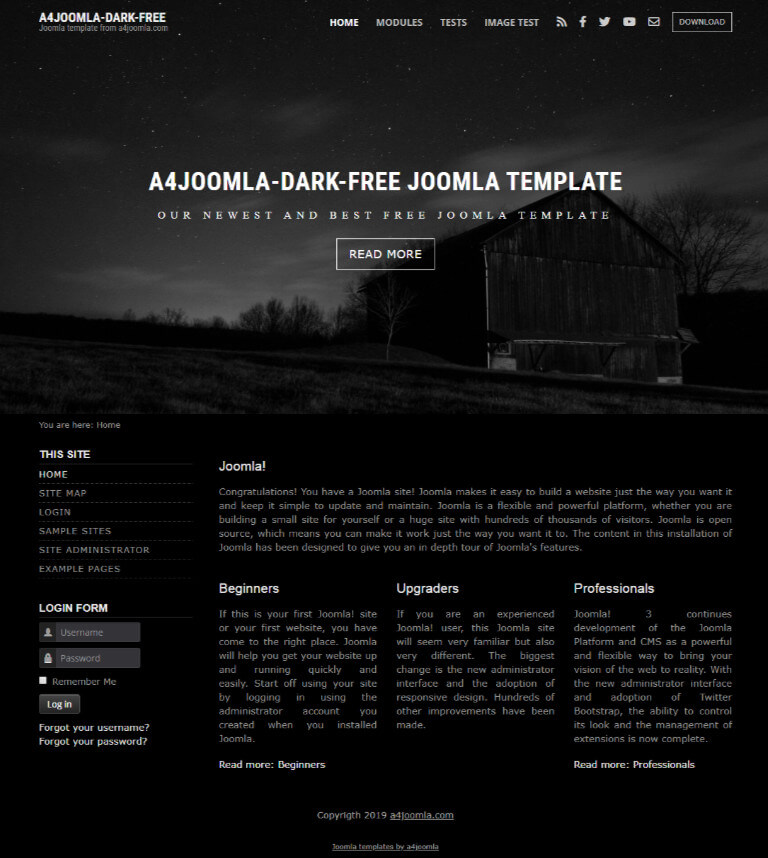
This template is responsive, so it adapts to the size of the mobile device. You can also see this on a desktop computer when you decrease the size of your browser. But it's worth hiding some of the modules on mobiles, because the order of the content of the website corresponds to the order of that in the source code. For this purpose you can use some css classes for the modules in the "Module class suffix". You can find the css classes for hiding modules here. You can hide modules on different display sizes: xs=extra small, sm=small, md=middle, lg=large, xl=extra large, xxl=the largest.
CSS modifications
You can put your own CSS code into the css/user.css file that you have to create if you need it.


